LIMS Data Analytics for Test Labs: The Numbers Worth Watching, and How to Get Them Without a Spreadsheet
· Updated
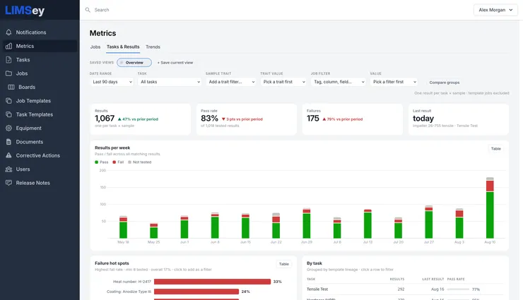
Ask a lab manager what their median turnaround time is and watch what happens. Either they know it, because they rebuilt the spreadsheet on Friday, or they know what it was the last time someone asked, which was a quarter ago. Ask which test fails most often and the honest answer is usually a name — “the anodize parts” — rather than a number.
That’s the state of lab data analytics in most test labs, and it isn’t a competence problem. The data exists; it’s in the LIMS, or the tracker, or the shared drive. What’s missing is the step from data to answer, and for years that step was an export, a pivot table, and an afternoon. This post is about closing it: which numbers a test lab should actually watch, what decision each one drives, and how a LIMS can compute them from data it already holds so nobody has to rebuild the spreadsheet again.
The screenshots are from a demo account’s tensile program, so the numbers are illustrative. The metrics are the real ones.
What LIMS data analytics should mean
LIMS data analytics is the analysis of the operational and result data a LIMS already holds — throughput, lead times, on-time performance, pass and fail rates, and measurement trends — computed inside the system, without exporting it first. That last clause is the whole point. A LIMS that can only produce these numbers through an export isn’t providing analytics; it’s providing raw material for yours.
There are two kinds, and labs need both:
- Operational analytics are about the lab: how much work comes in, how long it takes, where it waits, whether it ships on time, and who’s carrying the load.
- Result analytics are about the parts: what’s passing, what’s failing, which measurement is drifting toward a limit, and which supplier lot or process step is behind the failures.
Most reporting tools do one. Most lab managers get asked about both in the same meeting.
The numbers worth watching in a test lab
Every metric below earns its place by driving a specific decision. If you can’t name the decision, it’s a chart, not a KPI.
Throughput — jobs created and completed per week. The baseline for everything else. Created versus completed tells you whether the backlog is growing; the trend tells you whether last month’s crunch was a spike or the new normal. Decision: staffing and scheduling.
Median lead time — submitted to complete. The number engineers actually experience, and the one to quote. Use the median, not the mean: one job that waited six weeks for a fixture will drag an average into fiction, and the median ignores it. Compute it from each job’s status history, not from a date somebody typed. Decision: what to promise requesters.
Time in each status. Lead time says how long; time in status says where. A job that spends 1.3 days in Submitted and 4.2 days In Process is telling you the queue isn’t the problem, the bench is — or the reverse. Decision: where to add capacity or change the process.
On-time completion against the requested date. The number leadership asks for, and the fairest single measure of whether the lab is keeping its promises. Measure it against what the requester asked for, not against an internal target the requester never saw. Decision: whether the intake process is setting realistic dates.
Pass rate and failure count. Per week, per task, per product line. A pass rate that drops three points while failures rise 79% is a different situation from a pass rate that drops three points because volume fell. Decision: whether something changed upstream.
Failure hot spots. The most useful number in the building, and the one no spreadsheet computes on its own: which combination of task, product, trait, or lot is failing most, ranked. A heat number failing 33% of the time is a supplier conversation. A coating failing 24% of the time is a process conversation. Both are invisible in an overall pass rate of 83%. Decision: who to call.
Measurement trends and control charts. Not pass/fail, but the actual values — ultimate tensile strength creeping toward the maximum, hardness scattering wider than it did in spring. A result can pass every time while drifting toward the day it won’t. Decision: intervene before the failures start.
Load by technician and by requester. Who’s doing the work and who’s asking for it. Useful for fairness, for capacity planning, and for the conversation with the requester whose fifty-seven jobs this quarter are all urgent. Decision: prioritization and staffing.
Equipment utilization and downtime. Which machines are the bottleneck and which sit idle; usually a custom view because every lab’s equipment is different. Decision: capital spending and scheduling.
That’s nine. Most labs can run on the first six. For the wall:
| Metric | What it tells you | Decision it drives |
|---|---|---|
| Throughput | Jobs created vs completed per week; whether the backlog is growing | Staffing and scheduling |
| Median lead time | Submitted → complete, the number requesters experience | What to promise requesters |
| Time in each status | Where the time goes: queue vs bench | Where to add capacity or change the process |
| On-time completion | Kept promises, measured against the requested date | Whether intake sets realistic dates |
| Pass rate and failures | Outcome trend, per week / task / product line | Whether something changed upstream |
| Failure hot spots | Which task, product, trait, or lot fails most, ranked | Who to call |
| Measurement trends | Actual values drifting toward a limit while still passing | Intervene before the failures start |
| Load by person | Who does the work, who asks for it | Prioritization and staffing |
| Equipment utilization | Bottleneck machines vs idle ones | Capital spending and scheduling |
What this looks like when the LIMS does the work
Here is the operational half, from the Jobs tab of LIMSey’s built-in Metrics: throughput, median lead time, and on-time rate, each with the change against the prior period, above a weekly chart of jobs created stacked by their current status.
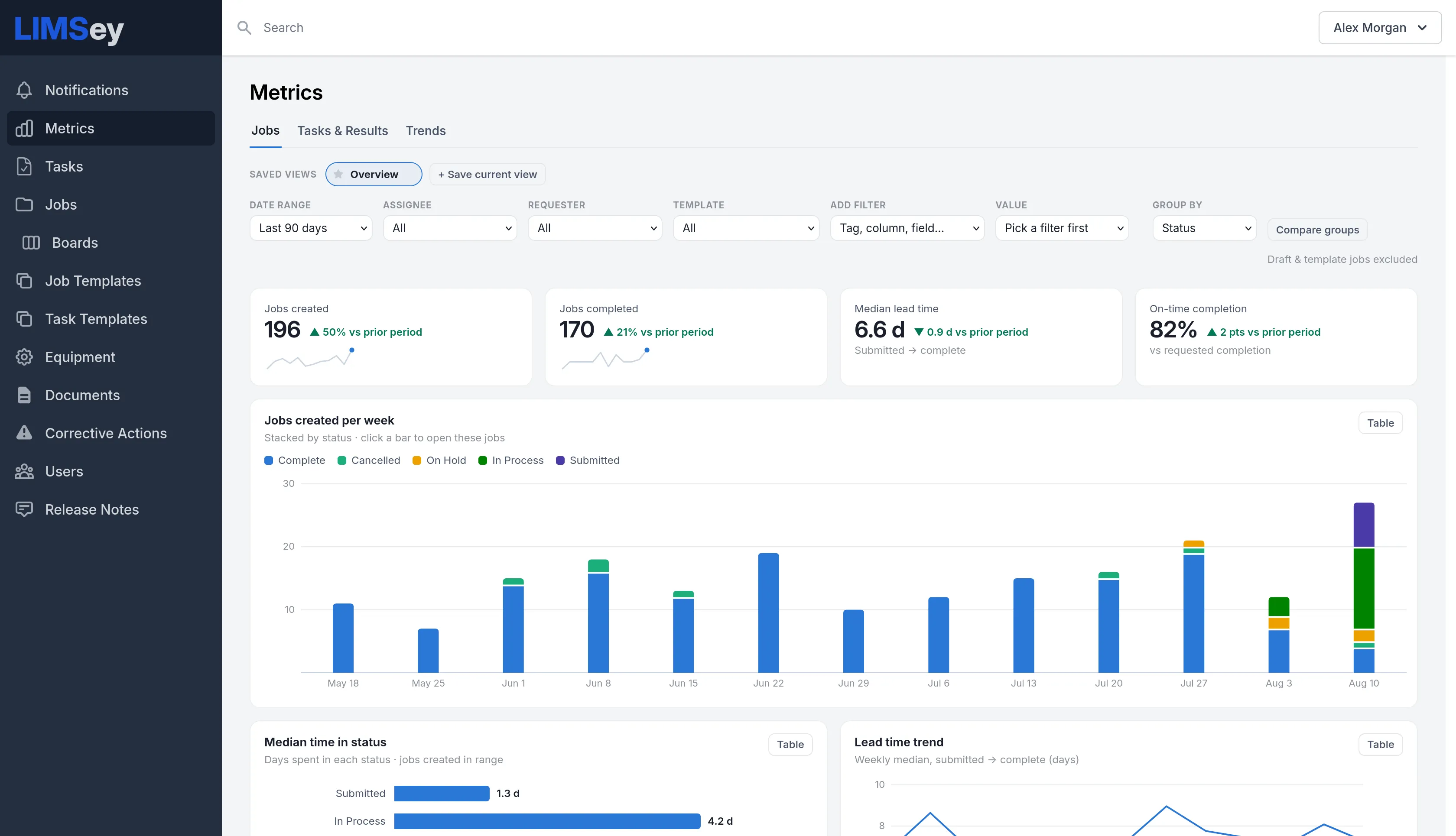
Three details matter more than the charts. The lead time is a median, computed from each job’s actual status history. The on-time figure is measured against the requested completion date. And the time-in-status breakdown underneath — 1.3 days in Submitted, 4.2 days In Process — is what turns “we’re slow” into “we’re slow at the bench, not at intake.” Nobody exported anything.
The result half lives on the Tasks & Results tab. Results are counted one per task and sample — the unit a test lab actually thinks in — with pass rate, failure count, and the last result recorded, then the weekly pass/fail chart and, below it, failure hot spots ranked by fail rate with a minimum sample count so a single bad part can’t top the list.
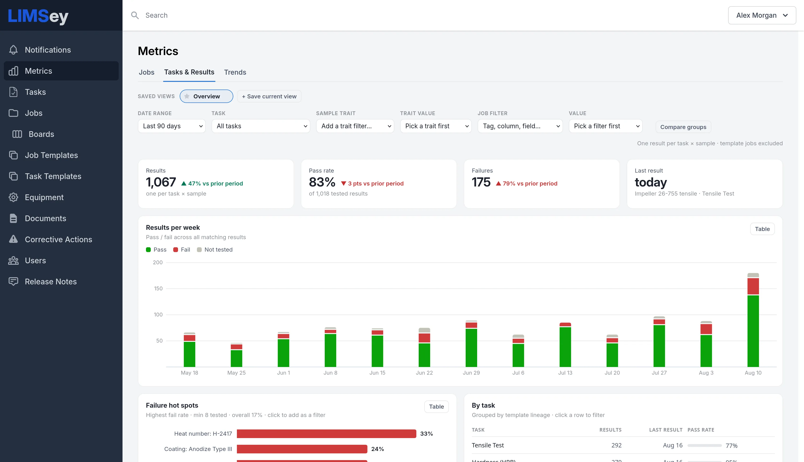
Look at the hot spots. The overall pass rate is 83%. Heat number H-2417 is failing at 33% and Anodize Type III at 24%. The overall number says “a bit worse than last period.” The hot spots say who to call this afternoon.
The Trends tab is the control-chart view. Pick a task, and every numeric measurement it produces gets a strip — one dot per sample, red where a result failed, the specification limits drawn in as zones, statistical outliers marked — with a value-over-time chart for whichever measurement you select.
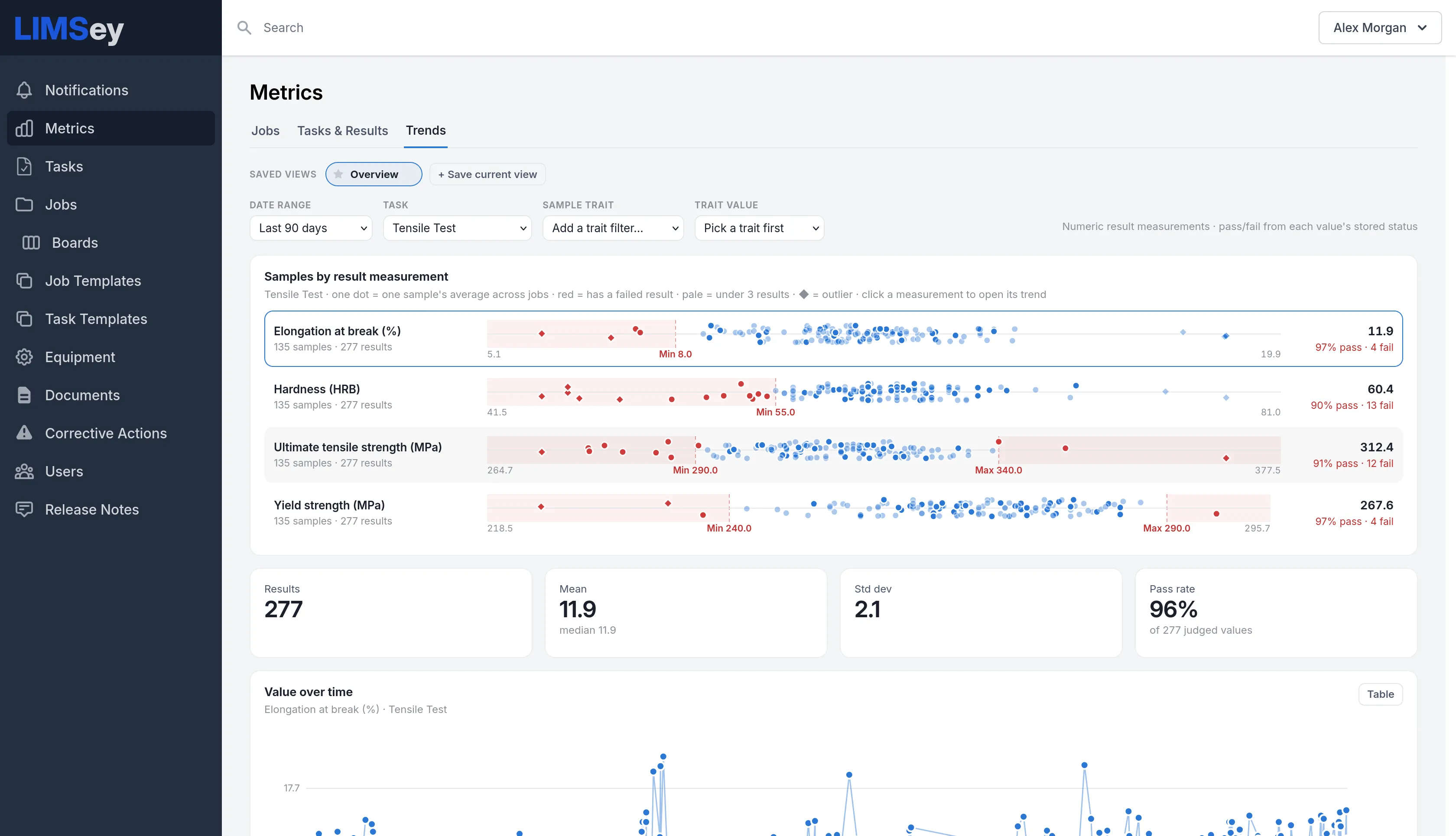
This is where “it passed” stops being enough. Ultimate tensile strength has a specification of 290 to 340 MPa; the mean is 312 with a standard deviation of 15.6, and the value-over-time chart shows exactly which recent results touched the ceiling. Hardness is passing 90% of the time, with thirteen failures clustered below the minimum. You could get the same picture from an export and a statistics package — the difference is that here it’s a click, and it’s current.
Every one of these views filters the same way (date range, assignee, requester, template, any tag, column, or field), any combination of filters saves as a named view, and up to three filter sets can be pinned side by side to compare — this quarter against last, one product line against another. It’s built to render in under a second on the largest accounts, because an analytics page you wait for is an analytics page you stop opening.
Rules for lab analytics that don’t lie
Whatever tool computes your numbers, these are the rules we’ve settled on. Each one exists because we’ve seen the alternative mislead someone.
- Medians, not means, for anything time-based. Lead times are skewed; a handful of stuck jobs will move an average by days and tell you nothing.
- Derive durations from the status history, never from typed dates. A “completed” date somebody entered on Friday for work finished Tuesday is the most common way lab metrics go wrong.
- Count results as task × sample. Five samples through one tensile test are five results, not one. Pass rates computed any other way aren’t comparable across tests.
- Set a minimum count before ranking anything. A hot-spot list without a floor is a list of things tested once.
- Compare like with like. Last quarter against this quarter, same product line, same test. Comparison groups exist so you don’t do this by eye.
- Attach a decision to every chart. If nobody would do anything differently based on a number, stop reporting it. Nine metrics with owners beat forty on a wall.
When built-in isn’t enough
Built-in metrics answer the questions every lab gets asked. Three things cover the rest.
Custom dashboards, built for you. When leadership wants a specific picture — jobs by business unit and location, tasks per technician, equipment utilization, job costing with labor hours and equipment rates rolled up — you describe it and we build it, starting from our templates and customizing until it matches your KPIs.
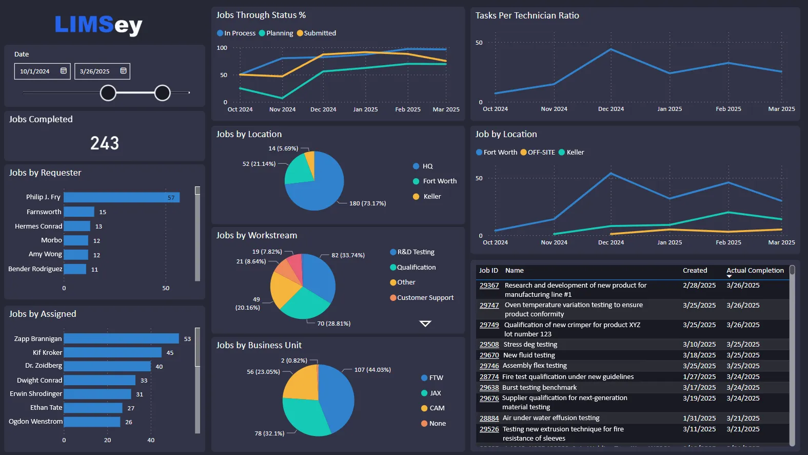
Power BI and other BI tools. Live data tables feed the reporting your company already runs, so lab numbers sit next to production and quality numbers instead of in their own silo.
Asking instead of building. LIMSey’s AI assistant answers plain-English questions about your lab data — completed jobs last month, busiest technician, biggest bottleneck — with a chart or table, for the questions that don’t deserve a saved view.
Getting there from a spreadsheet
If your lab’s data lives in a tracker today, none of the above is available to you yet — not because the analysis is hard, but because the data isn’t structured for it. Good lab data management is the prerequisite, and it comes down to four things:
- Statuses with timestamps. Every job moves through named states, and the system records when. This alone unlocks lead time, time in status, and on-time rate.
- Structured results. Each measurement stored as a value with units and a pass/fail judgment against a stated limit — not a number typed into a cell with the spec in someone’s head.
- Samples with traits. Heat number, coating, supplier, lot, product line — whatever your failures might correlate with — recorded as fields, so hot spots can be found.
- A requested date on every job. Without it, on-time is undefined.
Labs that move from spreadsheets to a LIMS usually have this structure within the first weeks, because the workflows require it. The analytics then come for free. We’ve written separately about what that move is really like and what a LIMS costs.
LIMS data analytics FAQ
What is LIMS data analytics?
The analysis of operational and result data held in a laboratory information management system — throughput, lead times, on-time performance, pass and fail rates, failure hot spots, and measurement trends — computed inside the system rather than through exports. In LIMSey this is the built-in Metrics area.
Which KPIs should an engineering test lab track?
Six cover most labs: jobs created and completed per week, median lead time from submission to completion, time spent in each status, on-time completion against the requested date, pass rate with failure count, and failure hot spots by task, product, or lot. Add measurement trends and per-person load once the first six are routine.
How do you calculate laboratory turnaround time?
As the median elapsed time from the moment a request is submitted to the moment the job is complete, taken from the system’s own status history rather than manually entered dates. Report the median, and report time in each status alongside it so the number explains itself.
Can a LIMS do statistical process control or control charts?
Yes, if it stores results as structured measurements with limits. LIMSey’s Trends tab plots every numeric measurement of a test as a control chart with specification zones, flags outliers, and shows the mean, standard deviation, and pass rate for the selected range.
Do I need Power BI with a LIMS?
Not for the questions every lab gets asked — a LIMS with built-in metrics answers those directly. Power BI earns its place when lab numbers need to sit alongside production, quality, or finance data in company-wide reporting; LIMSey feeds it live data tables for exactly that.
How does a LIMS improve lab data management?
By forcing the structure analytics depends on: timestamped statuses, results stored as values with units and pass/fail against a limit, samples with traits, and a requested date on every job. Once the data has that shape, the metrics are a by-product rather than a project.
Bring the question you keep getting asked
The fastest way to judge any lab analytics is to bring the question you’re tired of answering by hand — median turnaround, the test that fails most, whether the backlog is really growing — to a demo and watch how long the answer takes. In LIMSey it’s a click. If it’s an export anywhere else, you already know what the next year of Fridays looks like.